
Minimalist Website Design Examples: Why do so many minimalist sites look polished but sell poorly?
Because removing elements is not the same as creating clarity. A sparse interface can still bury the offer, weaken the message, or leave buyers without enough context to act. Good minimalism has a job. It directs attention, reduces friction, and makes the next step obvious.
That is the lens for evaluating minimalist website design examples in this guide. The goal is not to collect attractive homepages and call it inspiration. The goal is to understand why a stripped-back design works, where it supports business goals, and where it creates trade-offs. In practice, the best minimalist sites usually make a few disciplined choices: tighter hierarchy, fewer competing actions, cleaner copy blocks, and a stronger connection between page intent and visitor intent.
And that is where a lot of galleries fall short. They show visual trends, but they do not explain what a business owner should copy, avoid, or adapt. This article takes a more useful approach. Each example is paired with a Strategic Takeaway and an Implementation Tip, so you can move from taste to decision-making.
If you are planning a redesign, it also helps to study minimalism through a conversion lens, not just a style lens. This practical guide to creating engaging online experiences through website design is a solid companion read for that reason.
Save the pretty references if you want. But judge them like a strategist. What did the designer remove? What did they keep? What business goal does that choice support? That is how focused design starts paying for itself.
1. Minimalist Website Design Examples: Mr. Green Marketing, LLC
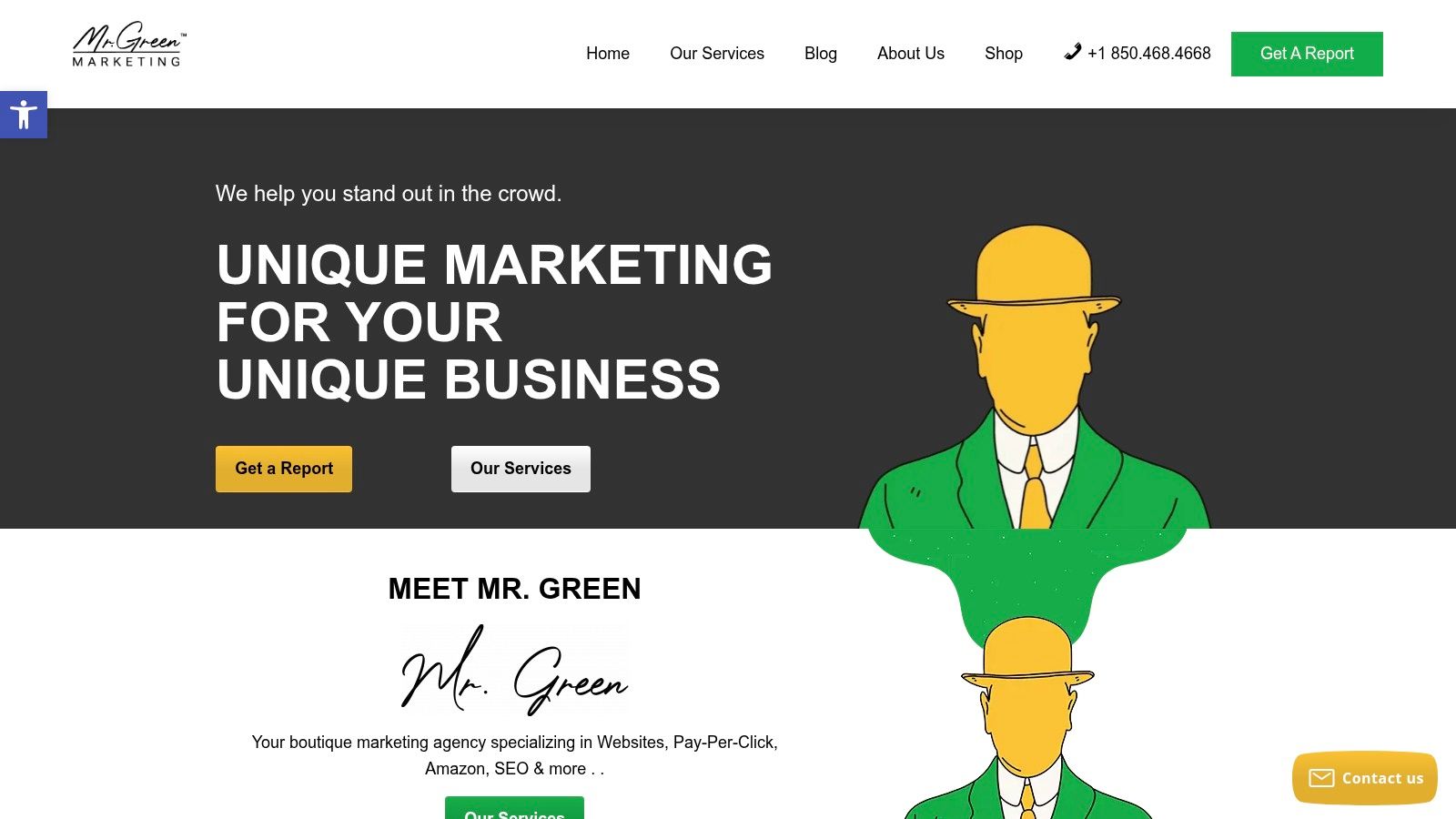
Mr. Green Marketing, LLC shows the version of minimalism most businesses need. Not gallery-piece minimalism. Commercial minimalism.
The site keeps the interface focused on service clarity, trust, and next-step movement. That matters. Agencies often clutter their own sites with too many specialties, too much self-congratulation, and a maze of portfolio pages. Mr. Green avoids a lot of that by making the offer structure readable and by keeping the visitor oriented around business outcomes.
Minimalist Website Design Examples: Why it works for business
This is a strategy-first site. The minimalism supports comprehension.
You can quickly see that the agency works across website design, SEO, PPC, Amazon marketing, branding, social media, podcast promotion, video, and logo creation. Normally, that breadth would create sprawl. Here, the cleaner presentation helps it feel coordinated instead of chaotic.
There’s also a smart business move in the free audit and performance report. Minimal design works best when the path forward is obvious, and this is a strong example of turning a broad service firm into a guided decision.
Practical rule: Minimalism should reduce decision fatigue, not reduce persuasive clarity.
The accessibility angle is another plus. The site’s commitment to inclusive design and ADA-minded tooling isn’t decorative. It signals that the team understands usability as part of performance, not as an afterthought.
A useful companion read is this piece on creating engaging online experiences, which aligns with the same underlying idea: strong sites need both restraint and intent.
Strategic takeaway
For service businesses, the best minimalist website design examples usually do three things well:
- Clarify the offer: Visitors should understand what you do without digging.
- Control the path: One primary action should stand out more than everything else.
- Support trust: Clean design still needs proof points, responsiveness, and signals of competence.
Mr. Green gets that balance mostly right.
What works and what doesn’t
What works:
- Full-service coordination: Businesses that want one partner instead of several specialists will understand the value quickly.
- Boutique positioning: The site communicates hands-on support rather than anonymous scale.
- Clear conversion path: The audit offer gives hesitant buyers a low-friction next step.
What doesn’t work as well:
- No public pricing: Some buyers want at least a starting range before making contact.
- Limited published proof depth: Testimonials and positive signals help, but more named case studies would strengthen the minimalist presentation with harder evidence.
Clean design can’t carry vague positioning. The simpler the layout, the more precise the messaging has to be.
Implementation tip
If you run a service business, borrow the structure, not the styling alone. Keep your homepage centered on one promise, one primary CTA, and a short list of capabilities that feel connected. If your services don’t ladder up to one clear business result, minimalism will expose that fast.
2. Minimalist Website Design Examples: Awwwards – Minimalist websites
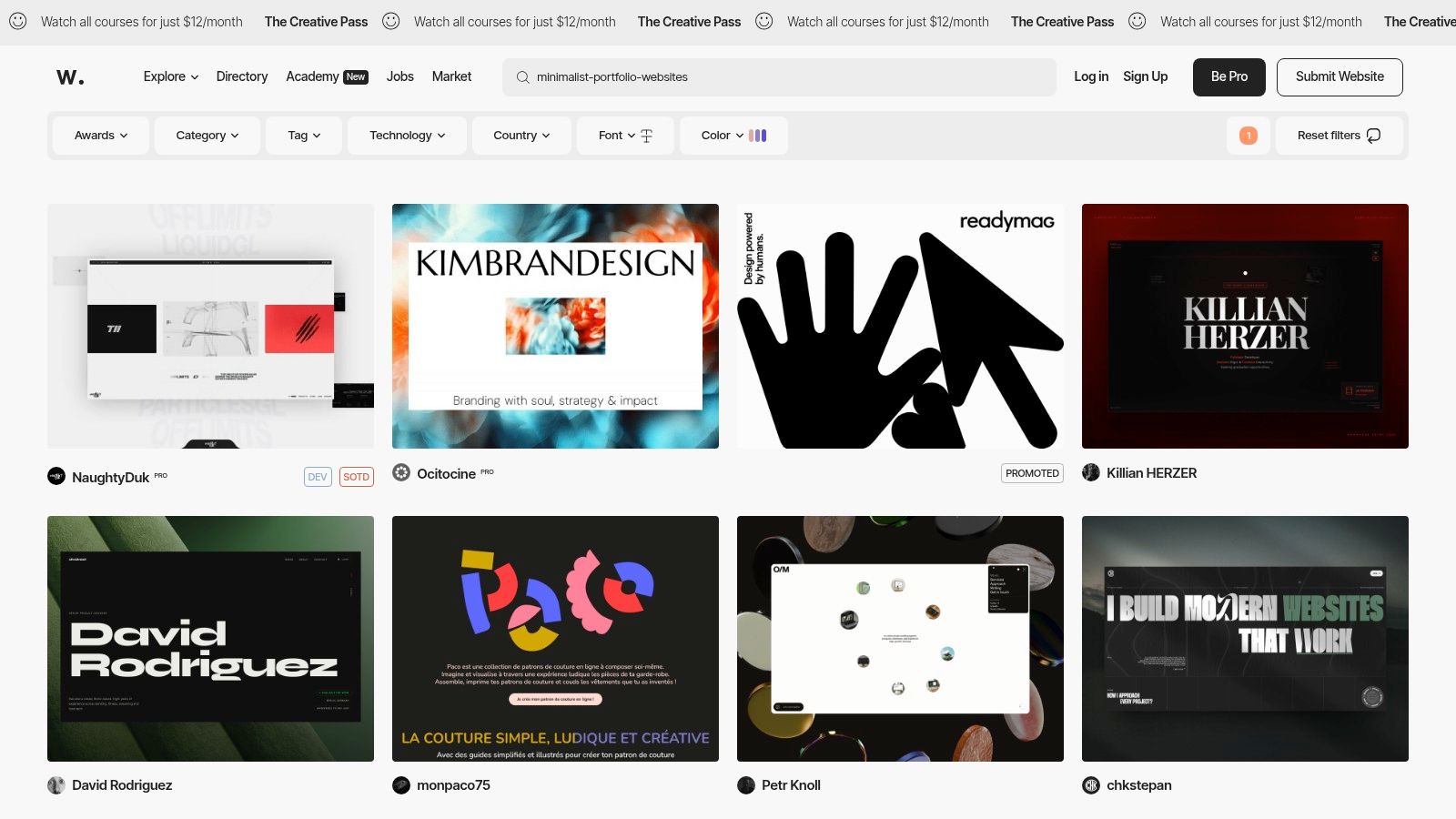
Awwwards minimalist websites is where you go when you want to see the polished edge of modern minimalism. The feed is current, visually strong, and useful for spotting where premium brands and studios are pushing typography, motion, spacing, and composition.
That said, it’s not where I’d send a business owner looking for instant copy-paste direction. It’s a benchmark tool first.
Where Awwwards is most useful
Awwwards gives you recency and context. You can see award status, dates, and the kind of work getting recognized right now. That helps when you want to know whether your idea of “minimal” is timeless, stale, or just trendy in the wrong way.
It’s especially good for studying:
- Typography-led layouts: Many featured sites use type as the main visual engine.
- Motion restraint: The better entries use animation sparingly, which is exactly how minimalism should handle movement.
- Whitespace systems: You can compare how different brands create breathing room without making pages feel empty.
Strategic takeaway
Use Awwwards to raise your standards, not to define your budget.
A lot of award-winning minimalist sites depend on custom motion, art direction, and interactions that aren’t realistic for many SMBs. And sometimes they prioritize spectacle over direct response. Beautiful? Yes. Commercially practical? Not always. Restraint matters here. Minimalist website design examples from Awwwards can teach hierarchy and confidence, but they can also tempt businesses into under-explaining their offer.
If a homepage needs a design jury to appreciate it, it may not be doing enough for a buyer who just wants answers.
Implementation tip
Study three Awwwards sites in your category and isolate only the transferable parts. Usually that means hero structure, spacing rhythm, type scale, and CTA treatment. Don’t import the whole experience. Especially not if your site needs to rank, load fast, and convert visitors who aren’t design-savvy.
3. Minimalist Website Design Examples: site Inspire – Minimal style
What do you look for when you need design inspiration you can use?
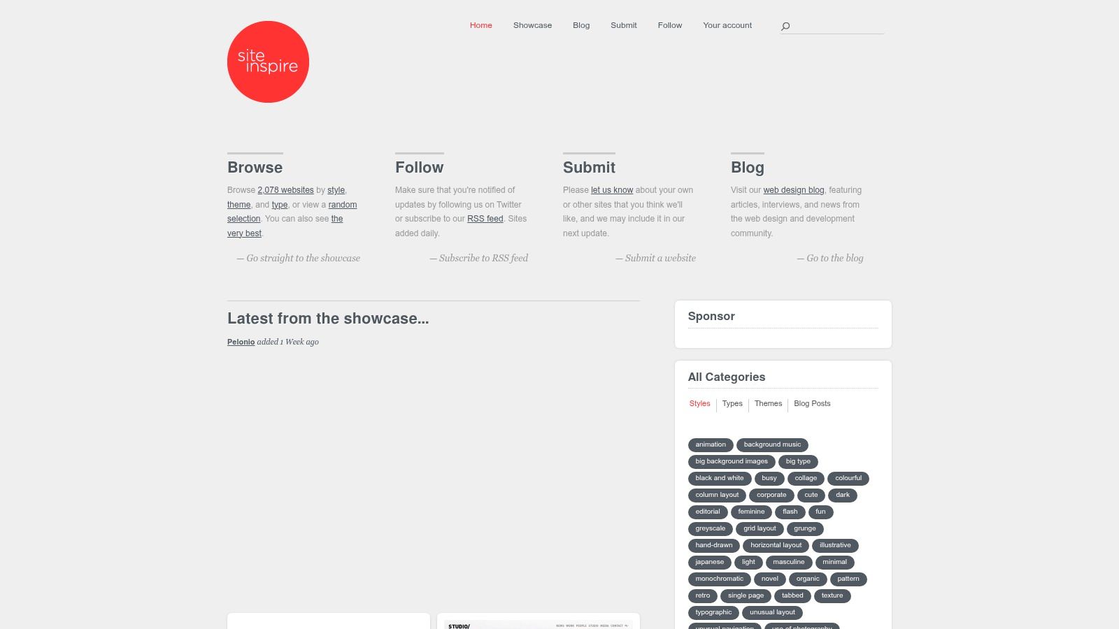
siteInspire earns its place because the work usually feels buildable. The collection skews toward clear structure, disciplined typography, and layouts that still leave room for real copy, real navigation, and real calls to action. For a business owner or in-house team, that matters more than pure visual novelty.
The filtering is a big part of the value. You can sort by Style, Type, and Theme, then narrow quickly to patterns that fit a SaaS homepage, editorial brand, ecommerce experience, or service business. That saves time. It also helps you study examples by business model instead of lumping every clean-looking site into the same bucket.
What makes siteInspire useful
siteInspire is strong for pattern spotting at the page-system level, not just the screenshot level.
A lot of galleries are good at giving you a mood. siteInspire is better for identifying choices you can carry into production:
- Content-led layouts: Pages make room for messaging, proof, and hierarchy instead of relying on decoration.
- Straightforward navigation: Menus are easier to scan and usually avoid clever interactions that get in the way.
- Reusable structure: The best examples show systems that can extend across landing pages, service pages, and case studies.
If your team is still turning inspiration into an actual workflow, this breakdown of the 6 steps of the design process helps connect visual research to decisions, reviews, and handoff.
Strategic takeaway
Use siteInspire when the goal is clarity with commercial value.
That distinction matters. Some minimal sites look polished because they remove friction. Others look polished because they remove information. Those are not the same thing. A portfolio can get away with ambiguity. A company selling services, software, or products usually cannot.
The best references on siteInspire show restraint without starving the page. They keep visual noise low, but they still explain the offer, direct attention, and support the next step. That is the standard worth borrowing.
Implementation tip
Build a swipe file by page function.
Save one example for hero messaging, one for service-page flow, one for testimonial placement, one for contact-page structure, and one for mobile navigation. Then review them side by side and ask a harder question than “Do I like this?” Ask, “What job is this section doing, and would it help my buyer decide faster?” That is how inspiration turns into a site that looks sharp and performs.
4. Minimalist Website Design Examples: Minimal Gallery
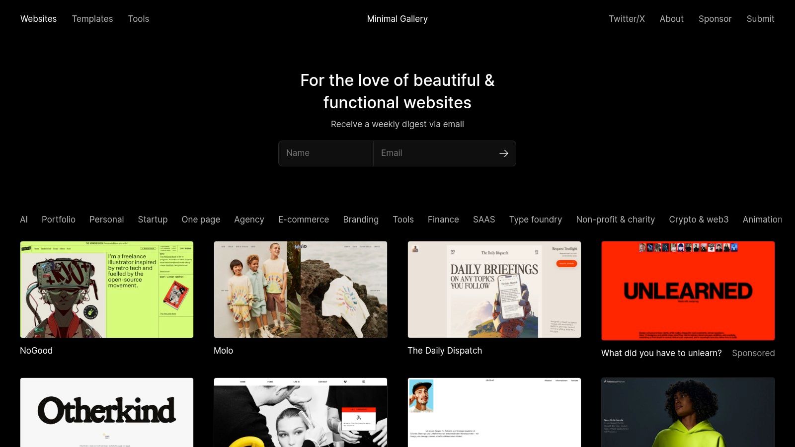
Minimal Gallery is useful for one specific job: training your eye.
Its value comes from constraint. The gallery stays focused on minimalist work, so you spend less time filtering out styles that have nothing to do with your project. That makes it a practical reference when a team has already chosen a direction and needs sharper visual judgment, not more options.
Minimalist Website Design Examples: What makes it useful
The curation is narrow enough to reveal patterns fast.
Browse a few entries across portfolio, startup, agency, and one-page sites, and recurring decisions start to stand out. Color stays restrained. Type carries more of the hierarchy. Spacing does real structural work: separating ideas, setting reading pace, and giving calls to action room to breathe.
That kind of focused review helps founders and in-house teams spot the difference between minimalism that supports clarity and minimalism that just strips the page down too far.
A broad gallery is better for exploration. Minimal Gallery is better for calibration.
Strategic takeaway
Use Minimal Gallery to define the visual rules of the system you want to build.
That includes choices like how many colors the interface needs, how bold the type hierarchy should be, and how much content can appear on screen without breaking the quiet, controlled feel. The gallery does not explain business strategy for you, and that is the trade-off. It gives strong aesthetic references, but you still need to judge whether a layout helps buyers understand the offer, trust the company, and take the next step.
Implementation tip
Set a hard limit before you browse.
Save five to seven examples, then translate what you saw into design rules. Pick a heading scale. Pick a spacing rhythm. Pick button styles, image treatment, and a color range. And stop there. Teams get stuck when inspiration keeps expanding after the decisions should have narrowed. Clean pages are easy to admire. Clear pages are harder to build.
5. Minimalist Website Design Examples: Land-book
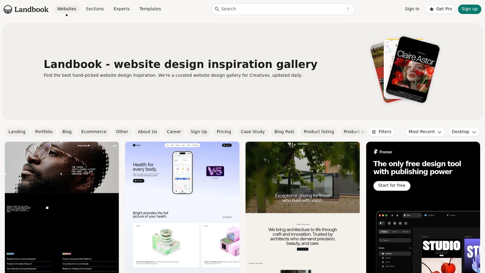
If your question is how minimalism works on landing pages, Land-book is one of the better places to look.
This gallery is less about abstract aesthetic inspiration, and more about conversion-oriented page patterns. That makes it especially useful for marketers, SaaS teams, consultants, and ecommerce brands trying to tighten a page around one action.
Where Land-book stands out
The filters are the reason to use it. Industry, style, color, typography, platform, and page sections all help narrow what you’re studying.
That sections library is particularly practical. Instead of reviewing entire sites, you can isolate:
- Hero blocks
- Pricing sections
- Product sections
- Feature grids
- CTA areas
For minimalist work, that matters because a lot of performance lives at the section level, not just the homepage level.
There’s also a useful stack perspective. If you’re working in Webflow, Framer, or Shopify, platform filters help you avoid falling in love with ideas that don’t match your production reality.
Strategic takeaway
Land-book is one of the strongest resources for finding minimalist website design examples that still have a sales job to do.
That said, keep your expectations disciplined. One verified research summary notes that minimalist website design ROI and conversion performance metrics remain largely undocumented, especially when compared directly against traditional layouts (Wix discussion of the evidence gap). So treat gallery examples as pattern references, not proof that a cleaner page will automatically outperform your current one.
Minimalism is a design approach. Conversion is an outcome. You still have to test the connection.
Implementation tip
When using Land-book, compare section patterns against your funnel stage. A minimalist hero for cold traffic shouldn’t work the same way as a minimalist pricing page for warm traffic. If the visitor still needs education, don’t strip out the explanation just because the layout looks elegant.
6. Minimalist Website Design Examples: Godly – Minimal collection
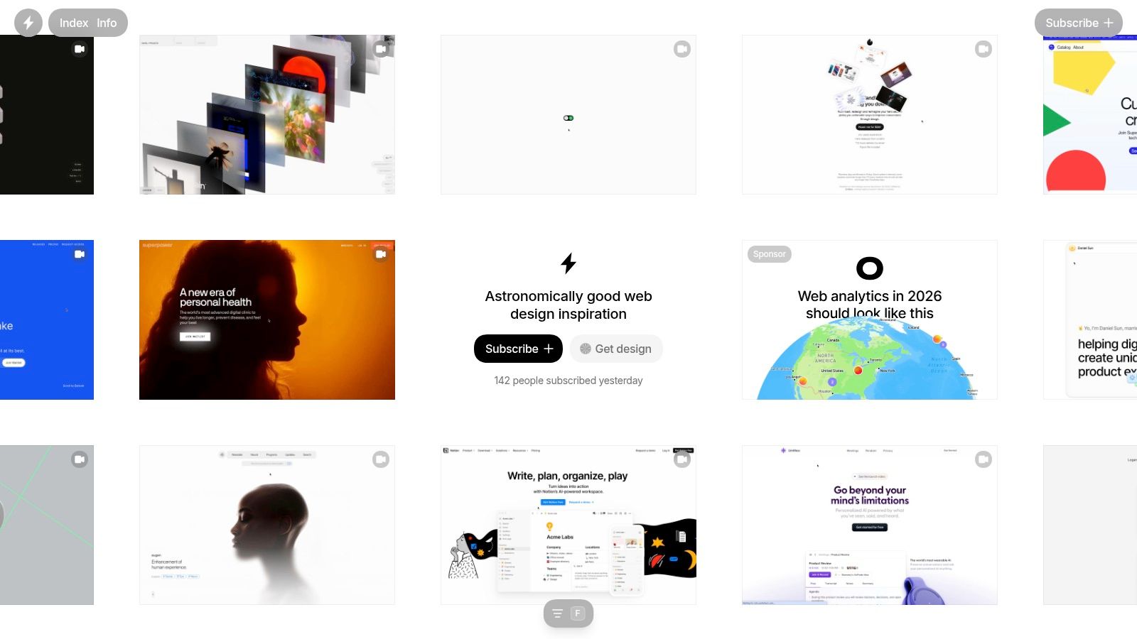
Godly is one of the fastest ways to study what minimalist web design looks like right now, especially for startups, agencies, and design-led brands. I use it less for validation and more for pattern spotting. You can see which ideas are gaining traction before they start showing up everywhere else.
What stands out in the Minimal collection is the shift away from sterile minimalism. The strongest examples still use restraint, but they also bring in motion, sharper type choices, stronger visual identity, and more editorial pacing. That matters because plenty of business sites confuse “minimal” with “empty,” and the result is a page that looks expensive but says very little.
Why Godly is worth using
Godly is useful when you need current references with some practical filtering built in. The tags and framework filters make it easier to study work that fits the kind of site you’re building, not just admire polished screenshots.
It’s especially good for reviewing:
- Motion that supports hierarchy instead of distracting from it
- Typography doing more of the communication work
- Portfolio and marketing pages with a clear point of view
- Framework-specific examples you can realistically build from
Mobile review matters here. A lot of these layouts are art-directed for a large screen first. If you’re collecting ideas from Godly, pair that process with a check on how to optimize a mobile website. Minimal layouts have less margin for error on small screens. If hierarchy slips, the whole page can feel vague.
Strategic takeaway
Godly is strongest as a trend radar. It helps teams study how minimalist design is being executed now, and then decide which ideas support their business goals.
That distinction matters.
Many of the best examples rely on typography, spacing, and sequencing to carry the message instead of using lots of UI chrome or explanatory graphics. You can observe that directly across the collection. Headline scale does more work. Spacing creates pause and emphasis. Motion often acts like a cue, guiding attention toward the next action or section. Used well, those choices can strengthen clarity. Used poorly, they create stylish ambiguity.
The value here is not the gallery itself. It’s the chance to ask better questions about what each design is doing for positioning, comprehension, and conversion.
Implementation tip
Review Godly examples with a simple filter: message first, hierarchy second, style third.
If a layout looks impressive but the offer is still hard to understand after a quick scan, don’t copy it. Borrow the pacing, the typography treatment, or the restraint. Keep the parts that help the visitor decide what to do next.
7. Minimalist Website Design Examples: Best Website Gallery (BWG) – Minimalist style
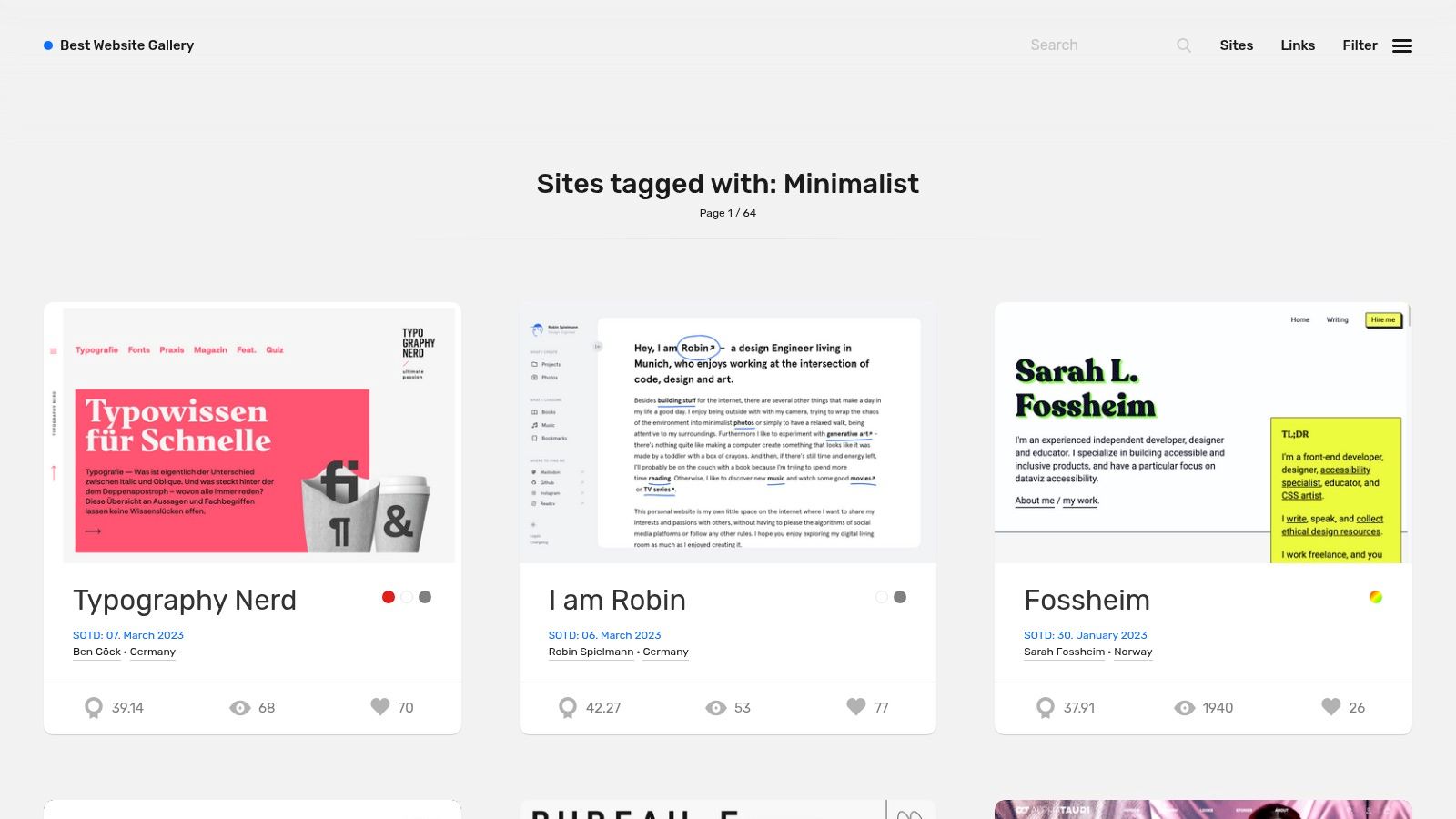
What helps a minimalist site still feel sharp three years from now, after the trend cycle moves on?
Best Website Gallery is useful for answering that. I use it less as a mood board, and more as a pattern library with a memory. Because the archive spans years and includes filters for CMS and style, it gives you a better way to judge whether a layout choice has staying power or just looked current for one season.
That distinction matters in redesign work. Teams often approve direction based on novelty, then run into the predictable problems later. Weak hierarchy. Unclear calls to action. Too little context around the offer.
Minimalist Website Design: Why BWG earns a spot here
BWG has a practical advantage over trend-heavy galleries. You can review minimalist sites through the lens of the platform behind them, including Webflow, WordPress, Craft, and Shopify. For a business owner, that makes inspiration more usable because the conversation quickly shifts from “Do we like this?” to “Can we build this well on our stack?”
A few strengths stand out:
- Historical range: You can compare how cleaner layouts held up across different periods.
- Platform context: Helpful for judging what is realistic to implement.
- Consistent curation: The collection feels edited, which speeds up research.
This gallery is especially good for separating style choices from structural choices. Style changes fast. Clear hierarchy, readable type, restrained navigation, and focused page goals tend to hold up.
Strategic takeaway
BWG works best for teams that want inspiration with a longer shelf life.
Minimalism performs well when it removes friction without removing meaning. That is the trade-off to watch. A sparse interface can improve focus, but it can also hide the value proposition if the copy, structure, or calls to action are too thin. The strongest sites in BWG usually keep the visual system restrained, while still making the next step obvious.
That is the lens to bring to every example. Study what the page is helping the visitor do. Sign up. Browse products. Book a call. Understand the offer quickly. The visual restraint only works when that job stays clear.
Implementation tip
Use BWG to run a simple durability test. Save a few examples from different years, then compare what stays consistent across them. You will usually find the same fundamentals repeating: strong headline structure, disciplined spacing, few competing actions, and content that explains the offer without clutter.
And if your team is debating whether to make the site “more minimal,” this gallery can keep that conversation grounded. Strip out decoration if you want. Do not strip out orientation.
Minimalist Website Design – 7-Site Comparison
| Source | Implementation complexity | Resource requirements | Expected outcomes | Ideal use cases | Key advantages |
|---|---|---|---|---|---|
| Mr. Green Marketing, LLC | Managed, higher complexity (agency-led multi-channel execution) | Moderate-high: custom strategy, ongoing budget, enterprise tools | Measurable visibility, higher conversions, revenue growth | SMBs and e-commerce needing a single coordinated marketing partner | Full-service offering, free audit, accessibility focus, transparent reporting |
| Awwwards – Minimalist websites | Low as an inspiration resource; high if replicating award-level effects | Low to browse; high design/dev effort to reproduce cutting-edge effects | Trend insights and high-design ideas (not always conversion-ready) | Agencies/studios trend-spotting and creative R&D | High editorial bar, dated awards context, broad industry coverage |
| siteInspire – Minimal style | Low-moderate: pragmatic patterns that are easy to adapt | Low to research; moderate to implement depending on complexity | Functional, content-first UX patterns that scale | Product sites, blogs, e-commerce and SaaS seeking reliable layouts | Attainable examples, strong focus on usability and grid/typography |
| Minimal Gallery | Low: distilled aesthetic inspiration only | Very low to follow; moderate to implement chosen designs | Aesthetic refinement and stronger minimalist visual language | Designers refining visual restraint and brand simplicity | Minimal-only curation, low-noise updates, focused examples |
| Land-book (Landbook) | Low-moderate: section-by-section patterns for landing pages | Moderate: useful templates, some Pro features behind paywall | Conversion-oriented page patterns and optimized funnels | Marketers building high-converting landing pages and pricing blocks | Deep filters, sections library, platform (Webflow/Shopify) relevance |
| Godly – Minimal collection | Low-moderate: contemporary examples with tasteful motion | Low to research; moderate for animations/interaction work | Modern, polished minimalist sites with personality | Teams wanting tasteful micro-interactions within a minimalist frame | Fresh, boutique examples; good no-code feasibility signals |
| Best Website Gallery (BWG) – Minimalist style | Low: curated, long-running references easy to browse | Low to research; moderate if matching specific CMS/stack | Timeless minimalist principles and platform-specific proof points | Projects requiring CMS/platform validation (WordPress, Shopify, etc.) | Long archive, consistent curation, CMS/platform tagging |
Minimalist Website Design: From Inspiration to Implementation Your Next Steps
Looking at minimalist website design examples is useful. Building a site that grows the business is the harder part.
The pattern across the best examples isn’t a specific font, color palette, or gallery-worthy layout. It’s purpose. Every strong minimalist site makes a few deliberate choices about what deserves attention, what can be removed, and what must remain for the visitor to feel confident enough to act.
That’s where businesses often get off track. They chase the visual language of minimalism and skip the strategic discipline underneath it. Then the redesigned site looks cleaner, but says less, explains less, and converts worse. Not because minimalism failed, but because the business removed friction and clarity at the same time.
A better starting question is simple: what is the one action this page needs to drive?
If the page should generate a lead, design around that. If it should book a consultation, support that. If it should sell a product, keep comparison, trust, and purchase cues intact. Less, but better. That’s the standard.
The strongest inspiration sources in this list help in different ways. Awwwards and Godly are great for pushing visual ambition. SiteInspire and BWG are better for practical, repeatable patterns. Land-book helps when the issue is landing page focus. Minimal Gallery is useful when you want a low-noise stream of pure minimalist references. And Mr. Green Marketing stands out because it shows what a business-facing, strategy-led version of minimalism looks like in practice.
If you’re working through a redesign, I’d keep two filters in place.
First, don’t confuse whitespace with hierarchy. A page can feel open, and still leave users unsure what to do next.
Second, don’t assume minimal pages always perform better by default. Use inspiration to shape a hypothesis, then validate it with testing, messaging refinement, and user behavior review.
If your current site feels cluttered, scattered, or too hard to update, this is also a good time to review modern build options. This guide to best no-code website builders is a helpful starting point if you’re evaluating whether a simplified platform fits your redesign.
And if you want help translating minimalist principles into a site that’s clean, persuasive, and conversion-focused, Mr. Green Marketing is worth a serious look. The agency offers a free audit and performance report, which is a smart first step if you need to identify quick wins before committing to a full redesign.
If your website feels busy but still underperforms, Mr. Green Marketing, LLC can help you simplify the right things. Their team builds strategy-led websites that pair clean design with SEO, PPC, Amazon marketing, branding, and conversion-focused execution. Request a free audit and performance report to see where your site is losing clarity, visibility, or leads, and get a practical plan for fixing it.
Leave a Comment
sing in to post your comment or sign-up if you dont have any account.