
7 Logo Design Examples: Collecting attractive marks isn’t a branding strategy. A strong logo design example reveals decisions about audience, positioning, industry conventions, scalability, and real-world use. The useful question isn’t “Which logo looks best?” It’s “What can this example teach me about building recognition across packaging, websites, social profiles, marketplaces, and motion?”
And the best research sources serve different jobs. Some help you identify visual patterns, others let you critique rebrands, study complete identity systems, compare applications, or prepare a focused client brief. The seven resources below move from structured logo research to deeper identity analysis, with Mr. Green Marketing positioned as an option for businesses that need strategy-led branding, logo creation, rebranding, and product-label support.
7 Logo Design Examples: Table of Contents
- 1. Branding Logo Design Rebranding Product Labels
- 2. LogoLounge
- 3. Brand New by UnderConsideration
- 4. Behance Logo and Identity Projects
- 5. Dribbble
- 6. BP&O Branding Packaging and Opinion
- 7. Logobook
- Top 7 Logo Design Resources Comparison
- Turn Logo Inspiration Into a Better Brief
1. 7 Logo Design Examples: Branding Logo Design Rebranding Product Labels
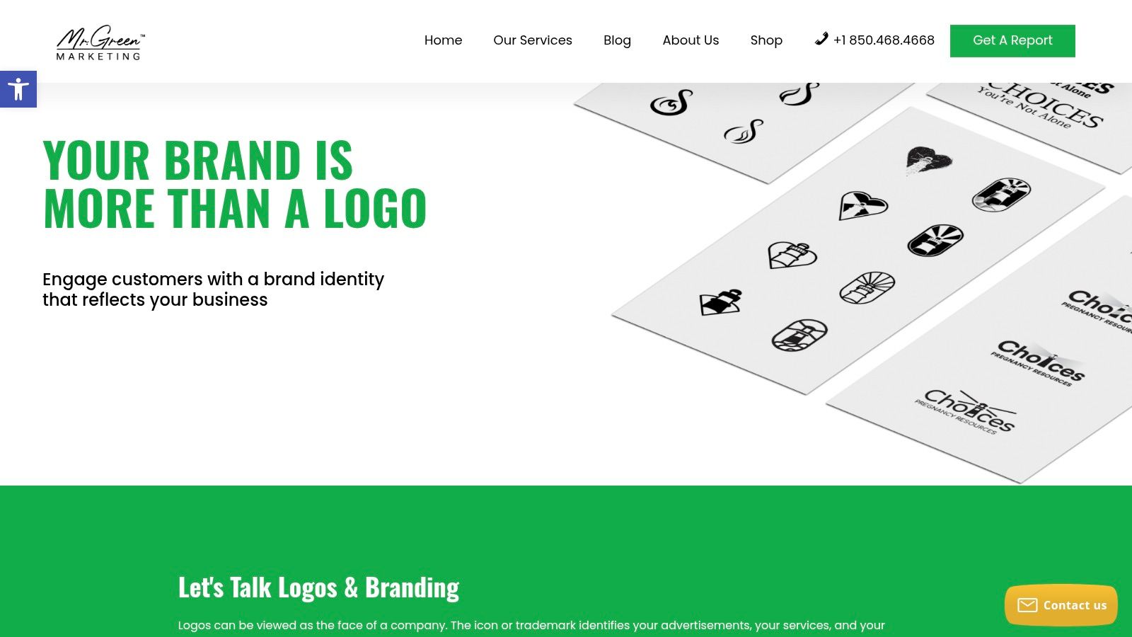
For a business launching or selling a physical product, a logo can’t be judged in isolation from the label, carton, marketplace listing, or product photography. Mr. Green Marketing’s Branding, Logo Design, Rebranding, and Product Labels service approaches the identity as a connected commercial system, starting with business goals and moving toward practical brand applications.
The process is discovery-led. The team listens to the business, reviews visibility, identifies quick wins, and develops a strategy that can guide the logo, wider brand system, and product labels. That matters for startups launching products, established companies refreshing a legacy identity, and Amazon sellers that need consistent creative across packaging, listings, and digital channels.
Why this source is useful
This is less a gallery for casual browsing and more a route from visual inspiration to implementation. Its strength is the combination of boutique attention and enterprise tools, including measurable KPIs, SEO and GEO thinking, reporting, testing, and accessibility-minded design.
A product logo needs to survive several conditions:
- Shelf competition: The mark must remain distinctive when surrounded by competing packages.
- Marketplace compression: Amazon and other retail platforms often display product imagery at small sizes.
- Cross-channel consistency: The same identity should work on labels, websites, social avatars, advertisements, and sales materials.
- Inclusive use: Contrast, legibility, and alternate versions should be considered before rollout.
The broader history of logo design supports this emphasis on practical recognition. Modern logo design is widely traced to industrialization in the mid-19th century, while the Coca-Cola wordmark introduced in 1886, created by Frank M. Robinson in Spencerian script, is often cited as a major milestone. Earlier, Averill filed the earliest registered U.S. trademark in 1870, showing that businesses were formalizing visual identifiers before modern mass branding fully matured. This history of logo evolution also describes the early-20th-century movement toward simpler, more direct marks.
Practical rule: If your logo will appear on packaging, approve the identity system and label hierarchy together. A polished standalone mark can still fail when the product name, claims, barcode, and required information compete for space.
The main trade-off is customization. The page doesn’t publicly list package pricing, so prospective clients will need to request a custom proposal and timeline. A bespoke process can also take more collaboration and cost more than a template-based service, but that investment is easier to justify when the business needs strategy, rebranding, product labels, and measurable digital execution in one engagement.
For businesses preparing a more complete brand identity development plan, this is the most relevant starting point on the list.
2. 7 Logo Design Examples: LogoLounge
LogoLounge serves a focused research task: identifying visual patterns before they shape a brief. Its searchable archive covers approximately 450,000 logos, with filters for industries, themes, symbols, and other characteristics. Use it to build a moodboard, check whether a category is visually crowded, or compare directions before choosing a design approach.
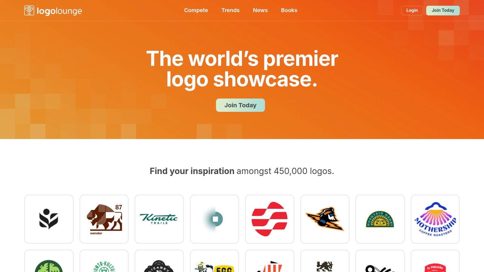
Search by industry, form, symbol, or color, then record repeated conventions alongside the references you save. A financial-services search may surface shields, geometric forms, and restrained palettes. Those patterns are useful evidence, not instructions to imitate. They show where a new identity needs a clear point of difference.
The archive also accepts member submissions, and uploaded work is automatically considered for the next LogoLounge book. Its annual Logo Trend Report summarizes recurring directions, giving teams another reference for separating durable design principles from temporary visual fashion.
Curation is the main benefit. Designers spend less time filtering unrelated work than they might on a general portfolio platform. The trade-off is limited context: the archive usually focuses on the mark rather than the customer journey, packaging system, website behavior, or reasoning behind a rebrand.
- Strong for: Building competitive references and spotting category patterns.
- Less useful for: Reviewing performance across a complete brand system.
- Budget consideration: Full access and submissions require paid membership.
Treat typography as a separate research task. A typeface that looks distinctive in a large presentation may lose legibility in an app icon or product thumbnail. Pair LogoLounge references with a practical review of modern fonts for logos, then test shortlisted choices against legibility, licensing, and actual use cases. The archive helps generate options. The brief still has to define where the identity must work.
3. 7 Logo Design Examples: Brand New by UnderConsideration
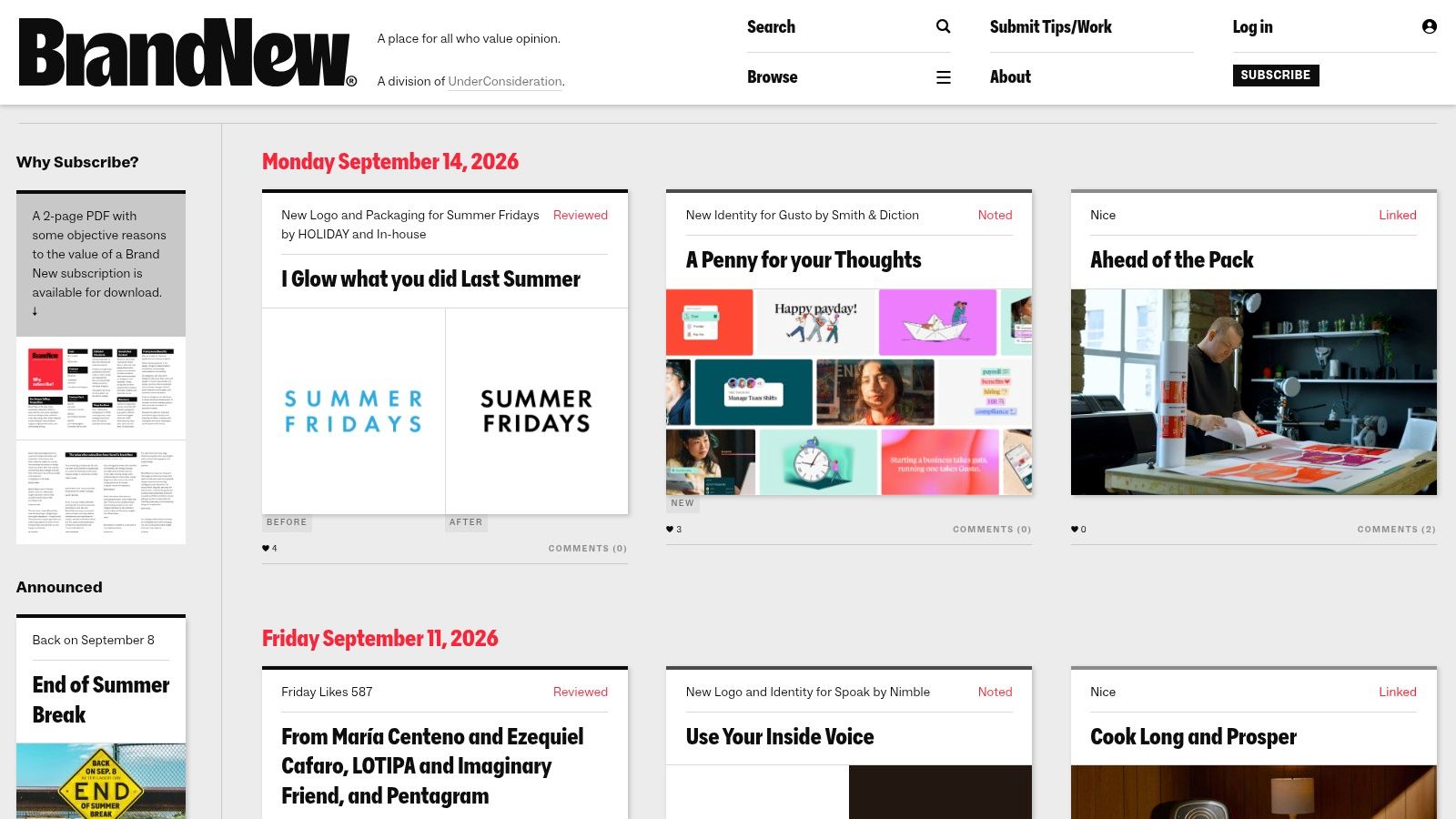
Brand New by UnderConsideration is a research source for evaluating rebrands, not only collecting attractive marks. Its editorial coverage examines new logos and broader identity programs, from major corporate changes to smaller launches. Posts may show before-and-after comparisons, applications, tags, and commentary on how the work could be received.
Use it when the question is, “Why did this organization change its identity, and did the change address the right problem?” That shifts the review from visual preference to business context.
Read the rebrand as a decision
“Reviewed” posts offer fuller analysis, while “Noted” and “Spotted” entries provide faster coverage. Browse by industry, project type, tags, or popularity. The archive dates back to 2006, which makes it useful for comparing identity decisions across different periods.
For each case, assess three areas:
- Strategic fit: Does the identity match the organization’s position and audience?
- System performance: Does the mark work with typography, color, layouts, digital products, and signage?
- Audience response: Do criticisms point to usability problems, or mainly resistance to change?
The site is especially useful for client education. It gives stakeholders language beyond “I like it” or “I don’t.” A logo may feel unfamiliar, while the more serious issue is weak small-size recognition, poor contrast, or an unclear relationship between symbol and wordmark.
Editorial judgment still has limits. Reviews reflect a viewpoint, not a neutral test panel. Brand New also lacks highly specific visual filtering, so finding only circular marks or a particular negative-space technique can take time.
Use a review to prepare a client discussion or brief. Record the stated business challenge, the identity response, and the applications shown. Then list the evidence your team would need before recommending a similar move. That might include small-size tests, audience feedback, or applications missing from the case study. The archive supplies informed examples. Your research process must determine whether the same decision fits your organization.
4. 7 Logo Design Examples: Behance Logo and Identity Projects
Use Behance to investigate how an identity operates across real touchpoints, not merely to collect attractive marks. Search “logo,” “brand identity,” or an industry term, then inspect project pages for mockups, grids, process work, packaging, stationery, websites, and social assets. This makes Behance useful for studying applications, comparing identity systems, and gathering material for a client brief.
Keywords, tags, and sorting by Most Appreciated, Most Viewed, or Recent support pattern research. Treat those rankings as discovery tools, not proof of strategic relevance. A highly visible project may reflect presentation quality or community interest rather than a brand problem similar to yours.
A more useful browsing method is to save projects by the decision they can inform:
- Application study: Check packaging fronts, seals, labels, avatars, favicons, website headers, mobile screens, and dark-background versions.
- System comparison: Record how layout, imagery, iconography, motion, typography, and color extend beyond the primary mark.
- Brief preparation: Note the business context, audience, stated challenge, and the applications shown.
- Evidence check: Separate sketches and rationale from proof that the identity works at small sizes, in production, or under accessibility constraints.
Behance’s strength is the amount of surrounding system work designers present. That suits brands using adaptive, kinetic, or motion-first identities. VistaPrint’s logo trend coverage discusses responsive logos, generative morphing, and legibility across touchpoints, useful prompts when deciding whether a flexible mark family fits the brief.
Quality and rights vary. Community appreciation and algorithmic discovery shape visibility, while attribution and usage permissions differ by project. Do not reuse a symbol, layout, illustration, or type treatment from a presentation without permission.
For client review, place saved references beside implementation requirements and identify what still needs testing. Mr. Green Marketing’s portfolio shows branding in a broader marketing context, helping teams compare complete presentations with isolated visual examples.
5. 7 Logo Design Examples: Dribbble
Dribbble is the fastest visual sweep on this list. Its Logo tagging and search tools surface a high volume of marks, logofolios, explorations, and multi-image posts. If you’re early in a project and need to understand the visual language of a sector, Dribbble can generate useful direction quickly.
The platform also connects inspiration with hiring. Designers can promote services, and pro-focused features support client matching and briefs. That makes it practical for businesses that want to discover a designer through a style they already understand.
Where Dribbble helps and fails
Dribbble’s strength is speed. You can scan marks across industries, compare typography treatments, and identify visual directions without committing to a lengthy case study. It’s also useful for finding designers whose work you may want to contact through the platform’s services marketplace.
Its weakness is depth. A shot may show a logo on a carefully controlled background without explaining the audience, positioning, testing, accessibility, or production constraints behind the design. Some work is exploratory rather than commissioned, and discovery can favor highly active accounts.
Use Dribbble for ideation, not validation. Save examples under practical headings such as “strong at small sizes,” “useful packaging lockup,” “interesting wordmark,” or “avoid because detail disappears.” Then review the design process before assuming the designer can solve a complex identity challenge.
A logo also needs a repeatable workflow. This graphic design process guide is a useful companion for turning quick visual references into discovery, concept development, revision, and final production.
A striking shot can start a conversation. It can’t replace a brand brief, application testing, or ownership checks.
6. 7 Logo Design Examples: BP&O Branding Packaging and Opinion
BP&O is designed for the research question that many logo galleries overlook: how does the mark work as part of a larger identity? Its reviews examine branding, packaging, strategy, and craft, giving teams more material for internal critique and client education.
That wider lens matters because a logo can be technically polished yet commercially weak. The symbol may fit a presentation board but fail on a product label, create poor hierarchy beside a wordmark, or become inconsistent when different teams adapt it for digital channels.
Use editorial analysis for team decisions
BP&O’s in-depth reviews and searchable filters make it useful as a reference library. The site also maintains a live archive orientation, with occasional logo roundups and galleries organized around specific themes. BP&O Plus adds features such as unlimited access, bookmarks, gallery view, and dark mode, although those premium capabilities require a paid plan.
When reviewing a project, ask:
- What problem did the identity solve? Look for evidence in the strategy and positioning.
- Where does the logo flex? Check packaging, digital layouts, signage, motion, and supporting assets.
- What creates recognition? Identify the consistent elements that remain stable across variations.
- What would be difficult to manage? Complex rules, too many versions, or unclear hierarchy can create operational friction.
The publication cadence is steadier than daily trend sites, so BP&O won’t provide the same stream of fresh releases as Brand New. That’s a reasonable trade-off. The slower, research-led format is better suited to deliberate comparison than rapid inspiration gathering.
For practitioners, BP&O is also a good antidote to subjective approval sessions. Instead of asking whether a logo feels attractive, ask whether the identity communicates the intended position, works in its required environments, and gives internal teams enough structure to use it consistently.
7. 7 Logo Design Examples: Logobook
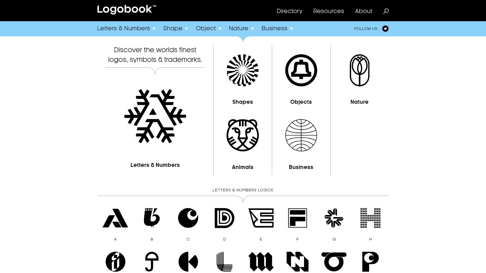
Logobook is a focused, free archive for marks, symbols, and trademarks. Its taxonomy lets you browse by initial letter, geometric shape, object, nature, and business sector. That makes it particularly effective for a narrow research task, such as comparing animal symbols, reviewing letterforms, or assembling references for a logo based on a specific visual idea.
Why simple marks deserve a separate study
Logobook emphasizes logos that read clearly in black and white, with an editorial preference for originality, simplicity, and clarity. That’s valuable because color can disguise structural weaknesses. Remove the color and ask whether the silhouette, spacing, and visual balance still communicate a distinct idea.
Its editorial policy excludes paid placements, helping keep the gallery merit-based. The site is less useful for full case-study research, however, because it offers less context about positioning, customer research, launch strategy, or brand applications. Submissions are currently suspended because of a backlog, and updates can be periodic.
Use Logobook to create a comp set by form, not to choose a final logo. Save examples that demonstrate:
- Clear silhouette: The mark remains identifiable without fine detail.
- Controlled geometry: Shapes feel intentional rather than generic.
- Useful negative space: Empty areas contribute to recognition or balance.
- Distinctive construction: The concept avoids blending into familiar category symbols.
This is also a good place to start before developing small business logo ideas. A small business usually needs a mark that can work on a website, invoice, social profile, sign, and printed material without demanding a complicated production system.
Top 7 Logo Design Resources Comparison
| Service | Implementation complexity | Resource requirements | Expected outcomes | Ideal use cases | Key advantages |
|---|---|---|---|---|---|
| Branding / Logo Design / Rebranding / Product Labels (Mr. Green Marketing) | High, bespoke, strategic process and cross-channel execution | Agency engagement, budget for custom work, stakeholder time | Cohesive brand identity and retail/Amazon-ready labels with measurable KPIs | Startups launching products; legacy rebrands; marketplace sellers scaling | End-to-end strategy-first service; boutique attention with enterprise tools; accessibility focus |
| LogoLounge | Low, research-focused platform use | Paid membership for full access and submissions | Large, curated reference set and trend insights | Designers researching styles, building moodboards, trend analysis | Massive vetted archive with strong filters and annual trend reports |
| Brand New (UnderConsideration) | Low, editorial reading and analysis | Free access; optional time investment to read critiques | Critical, contextual reviews and before/after comparisons | Studying rationale, public reception, and design critique | Thoughtful editorial critique with frequent, tagged coverage |
| Behance (Logo/Identity projects) | Low, search and review platform | Free to browse; account useful for saving projects | Broad, current examples often including process and mockups | Trend scanning, sector-specific inspiration, process study | Large community with many process-rich project pages; no paywall for viewing |
| Dribbble | Low, fast visual browsing and contact flow | Free browsing; Pro features paid for enhanced search/contact | Quick visual inspiration and designer discovery | Rapid style sweeps, finding designers or short-form portfolio pieces | Visual-first discovery and integrated marketplace to contact creators |
| BP&O (Branding, Packaging & Opinion) | Low to moderate, editorial reviews and archives | Mostly free; premium membership for full features | Researched reviews and practical reference material for teams | Client education, internal critique, studying applied identity systems | Research-led commentary and practical site features for team reference |
| Logobook | Low, targeted archive browsing | Free access (submissions may be limited) | High-quality mark examples emphasizing clarity and simplicity | Finding logos by letter, shape, object, or sector for comps | Laser-focused taxonomy and curated, merit-based gallery |
7 Logo Design Examples: Turn Logo Inspiration Into a Better Brief
The right logo design examples don’t give you a finished answer. They give you evidence for a decision. Start by defining the business type, audience, competitive category, and places where the logo must appear. A local service provider, an Amazon seller, a software company, and a packaged-food startup may all need logos, but their recognition problems and application constraints aren’t the same.
Collect references by strategic purpose rather than personal taste. Create separate groups for typography, symbols, packaging, responsive behavior, motion, and complete identity systems. Note what each example does well, what you’d avoid, and which element is doing the recognition work. A moodboard full of attractive marks is less useful than a smaller set with clear annotations.
Test candidates in black and white, at small sizes, and against both light and dark backgrounds. Vector production matters because vector files use mathematical curves and can scale without losing quality, while raster files are pixel-based and lose quality when enlarged. Common vector formats include AI, EPS, and SVG, while PNG and JPG are common raster formats. This logo file format guide explains the practical distinction.
Accessibility needs to enter the brief before approval. General graphics guidance commonly uses a 3:1 contrast ratio, while normal text uses 4.5:1 and large text uses 3:1, according to independent logo accessibility guidance. Logos and brand names themselves are exempt from WCAG contrast minimums, but a logo used as a functional homepage control must meet 3:1 contrast against surrounding colors under Section 508. Digital.gov’s visual design guidance also defines the contrast ratio formula as ((L1 + 0.05) / (L2 + 0.05)).
Your final brief should specify positioning, audience, required use cases, packaging or marketplace needs, accessibility requirements, file formats, responsive variations, and success criteria. Don’t evaluate only subjective preference. A useful logo case study can track recognition surveys, customer feedback, website traffic, email click-through rates, social engagement, and sales where available, creating an impact dashboard rather than relying on approval-room enthusiasm. Practitioner guidance on logo case studies outlines this before-and-after approach.
Mr. Green Marketing can help turn that research into a listening-led audit and a custom branding engagement, whether you need a new logo, a rebrand, product labels, or a broader identity system. The strongest next step is a brief built around how your business must be recognized and used, not a collection of marks that look good on a screen.
Mr. Green Marketing, LLC offers strategy-led branding, logo creation, rebranding, product-label design, SEO, GEO, PPC, Amazon marketing, and conversion-focused digital execution for growing businesses. Visit Mr. Green Marketing, LLC to request a free audit and discuss a custom identity plan built around your real applications and measurable goals.
Leave a Comment
sing in to post your comment or sign-up if you dont have any account.